MEME'S TOUCH
BRAND DESIGN
LOGO DESIGN
CREATIVE DIRECTION
THE CONTEXT
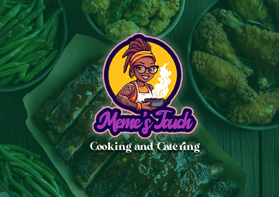
The goal of this project was to develop a full visual identity for Meme’s Touch—a Southern cooking and catering business that needed branding as flavorful as its food. The client wanted a design that felt personal and professional, capturing the soulful warmth of home cooking while standing out in a modern food-service market.
From the logo to the menu and merchandise, the vision was to create a brand that feels authentic, approachable, and full of personality—one that reflects Meme’s story, celebrates her roots, and builds trust with new customers at first glance. This project was about bringing her legacy to life through color, illustration, and visual storytelling.


The design centers around a hand-illustrated logo that channels Meme’s personality: warm, confident, and rooted in culture. A rich palette of royal purple, sunny yellow, and vibrant teal evokes the soulful energy behind every plate. Custom brand elements—from menus and aprons to business cards—bring cohesion across every touchpoint, while bold typography and playful accents reflect the heart and hustle of the kitchen.
Everything from the fried fish to the pineapple lemonade feels "Made with Meme’s Love"—and the brand design follows that same recipe: care, creativity, and cultural flavor blended into a visual identity that’s both modern and meaningful.
THE PROCESS
